Build 3.5.0.89 of xlsgen refines a feature meant to create great looking charts. This is the first build and it will be followed by more of it.
In build 3.5.0.61, xlsgen added support for 48 chart styles for use when creating/updating XLSX files (and their variants). These are wonderful chart styles one can pick among 48 for any chart type, but as it turns out, it is harder than usual to pick which one would be good to use because this is just a list of unspecified 48 chart styles.
At least, according to the way Excel stores this information inside files. xlsgen tries to make things more palatable for users out there. This is why we are refining this by sorting out the 48 chart styles according to what they can be used for.
Here are the 48 chart styles,

There are 6 rows of 8 styles, thus 48 styles.
The 48 styles are spread around two axis, vertically the effect span, horizontally the color span. Each row thus has 8 color variants : the grayscale, the automatic colors, and then 6 primary theme color selections. There are 6 rows accounting for 4 gradual effect spans : no effect, subtle effect, moderate effect, intense effect, and then two more rows for the classic Excel 2003 mode and the intense dark mode (dark background which may be white depending on your system background and foreground colors).
How it works in
xlsgen is quite simple. Here is a piece of code in C++ for a creating a pie chart with, as in the example above, the moderate effect, and auto colors :
chart001s0->Theme->EffectSpan = xlsgen::chartthemeeffectspan_moderate;
chart001s0->Theme->ColorSpan = xlsgen::chartthemecolorspan_auto;
Here are two examples of such chart styles :
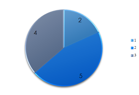 A pie chart made with moderate effect and auto colors
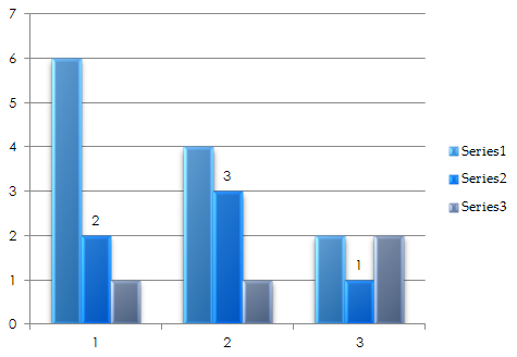 A bar chart made with moderate effect and auto colors
Charts look professional.